Case Study: CRO for a Belgian Fashion Webshop - How We Increased Conversion Rate by 40%

Key Takeaways
- •A Belgian women's fashion brand had strong Meta traffic but a conversion rate that pointed to store-side friction, not an audience problem
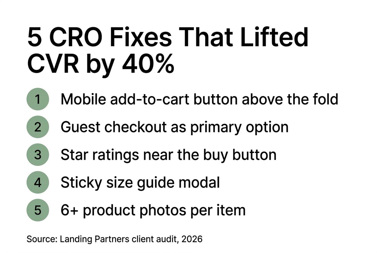
- •Our audit identified five blockers: too few product photos, a buried size guide, no social proof near the add-to-cart button, a forced account step at checkout, and a broken mobile CTA
- •We fixed them in order of expected impact - no full redesign, no new platform
- •Twelve weeks later: conversion rate up 40%, same ad spend, meaningful monthly revenue gain
- •The lesson: most fashion webshops are leaking revenue through fixable UX problems - paid media only amplifies the leak
The Brief
The brand came to us with a clear problem: their Meta campaigns were performing. Click-through rates were healthy, cost-per-click was in line with what we see across similar accounts, and their creative was genuinely good.
But the sales weren't following. The numbers looked like this: strong top-of-funnel, a drop-off at the product page, and a checkout that was bleeding what little traffic made it through.
**The traffic wasn't the problem. The store was.**
This is more common than most brands realise. When Meta spend goes up and revenue doesn't follow proportionally, the instinct is to blame the ads. Change the creative. Test new audiences. Adjust the bid strategy. But often, the ads are doing their job - they're bringing in the right people at the right time. The webshop just isn't converting them.
Before touching the campaigns, we asked for a 30-day analytics deep-dive.
What the Audit Revealed
We started with the data: session recordings, heatmaps, GA4 funnel analysis, and a structured walkthrough of the store on mobile and desktop. The brand had around 15,000 monthly sessions from paid traffic. Around 78% of those sessions were on mobile.
78% of sessions came from mobile - but the product page and checkout were built for desktop. That mismatch alone explained a significant share of the drop-off.
The audit surfaced five issues. Not fifty. Five. And they had very different priority levels.
Issue 1: Product photos - not enough, wrong sequence
The brand had 2-3 photos per product. For most fashion categories, that's not enough. Shoppers want to see the product from multiple angles, on a body, with a detail shot of the fabric, and ideally a lifestyle context. Their hero images were clean and professional - but the gallery stopped there.
Session recordings showed users scrolling up and down the product page looking for something they couldn't find, then leaving. The product wasn't the issue. The information gap was.
Issue 2: The size guide was invisible
It existed - buried in an accordion at the bottom of the product page. On mobile, users never saw it. When they don't feel confident about sizing, they don't buy. This is especially true for €100+ price points where a wrong-size purchase feels risky.
Issue 3: No social proof near the add-to-cart button
Reviews existed on the site. But they were on a separate reviews page - not on the product page itself, and not near the decision point. The add-to-cart button was surrounded by: the price, a size selector, and empty space. No review count. No star rating. Nothing to reduce the perceived risk of buying from a brand the visitor had just discovered.
Issue 4: Forced account creation before checkout
New visitors who clicked 'checkout' were immediately asked to create an account or log in. Guest checkout existed - but it was a small, easy-to-miss secondary option. A meaningful share of checkout-stage drop-offs happened right here.
Issue 5: The add-to-cart button was below the fold on mobile
On most product pages, a mobile visitor had to scroll down past the product title, price, a description paragraph, and a review blurb before they could even see the 'Add to Cart' button. Users who didn't scroll never saw the button.
If your webshop has similar issues and you're spending on paid traffic, you're amplifying the leak. Book a free webshop audit and we'll tell you what's actually costing you conversions.
The CRO Roadmap
Not every fix is equal. Some take a week. Some take a month. Some require developer resources the brand didn't have at the time. We prioritised by: expected impact, implementation speed, and resource requirement.
**The rule we follow: fix the highest-impact, lowest-effort items first.** A perfect site no one can launch in time is worth less than a good-enough fix shipped this week.
Our roadmap for this brand:
• Week 1-2: Mobile CTA fix + guest checkout prominence (low effort, high impact)
• Week 3-4: Social proof on product pages (medium effort, high impact)
• Week 5-8: Size guide redesign as sticky modal (medium effort, high impact)
• Week 9-12: Product photo expansion (high effort, medium-high impact)
We ran the first three changes before touching the photo library. That decision mattered - it kept the brand moving while the bigger project (photography) was in motion.
Implementation - What We Actually Changed
Change 1: The mobile add-to-cart button
We restructured the product page layout so the Add to Cart button is visible on first scroll - within the first 400px of the page on any standard mobile device. Title, price, size selector, add to cart. In that order. Everything else - description, care instructions, delivery info - moved below.
This is a one-developer-day fix. The change to session behaviour was visible in heatmaps within 72 hours: more taps on the add-to-cart button, earlier in the session.
Change 2: Guest checkout - front and centre
We redesigned the checkout entry screen to put guest checkout as the primary option. Account login became secondary. The visual hierarchy flipped. A sentence was added: 'No account needed - check out in 60 seconds.'
**The single biggest checkout friction point for new visitors is the account wall.** Most brands don't realise this because their internal team is always logged in when they test the checkout.
Change 3: Star ratings on the product page
We pulled the brand's existing reviews into the product page - displaying an aggregate star rating and review count directly below the product title, above the price. A 'Read 47 reviews' link opened a modal with the full review list.
This added roughly 4 lines of code and an API connection to their review platform. Implementation: two days.
Change 4: Sticky size guide modal
The size guide became a 'What's my size?' sticky CTA that floated near the size selector. Clicking it opened a clean modal with a simple measurement chart. No page navigation required. No scroll.
We also simplified the chart itself - the old version had 12 columns of measurements most shoppers didn't understand. The new version had three: height range, weight range, recommended size.
Change 5: Product photo expansion
This was the most resource-intensive change. Over a 4-week period, the brand photographed their full in-season collection with a new brief: minimum 6 images per product, required shots including on-body, detail, and flat-lay. Hero image sequence was standardised across the store.
Product pages with 6+ images converted at a rate 28% higher than products with 3 or fewer images - measured across the same 90-day window, same traffic source.
The Results
We measured across a 12-week pre/post window, same traffic channels, adjusted for seasonality.
Conversion rate: from 0.72% to 1.01%. A 40% lift.
**At the same monthly ad spend, that translated to roughly 29 more purchases per 1,000 visitors.** At their AOV of €142, that's a meaningful monthly revenue gain without a single additional euro spent on acquisition.
The changes didn't perform equally:
• Mobile CTA + guest checkout: accounted for roughly half the total CVR improvement
• Social proof: measurable uplift on mobile, smaller on desktop
• Size guide modal: difficult to isolate but anecdotally reduced size-related returns
• Photo expansion: largest individual per-page impact but took the longest to roll out
The two fastest changes - mobile layout and guest checkout - delivered around 50% of the total CVR gain. Both took less than a week to implement.
We do webshop audits for fashion brands before recommending any increase in ad spend. If your traffic is healthy but your revenue isn't growing proportionally, the fix is usually in the store - not the ads. Book a free audit here.
What This Means for Your Brand
Every brand's conversion rate depends on its price point, category, and traffic source. There is no universal benchmark for what your CVR should be - a luxury brand at €400 AOV will always convert lower than a €60 streetwear brand on the same traffic volume. That's not a failure. It's the math of premium positioning.
But there are patterns we see across the 100+ fashion brands we've worked with:
**Most stores have at least two or three fixable blockers that are costing them measurable revenue right now.** They're not always obvious from the inside. The team is too close to the product, and they test the store while logged in, on a MacBook, with fast wifi. They never experience their store the way a first-time mobile visitor does.
What this case study shows is that CRO doesn't have to mean a full redesign. It means finding the specific friction points in the specific path your visitors actually take - and removing them, one by one, in order of impact.
The mistake most brands make is doing this backwards: they start with a full redesign because it feels comprehensive. In reality, a redesign takes 3-6 months, disrupts continuity, and often introduces new problems while solving old ones. **Start with the audit. The data tells you where to look.**
Lessons from This Project
A few things we took from this engagement that apply broadly:
1. Mobile-first is not optional
When 75-80% of your traffic is on a phone, every design decision needs to be made on a phone. Not in Chrome's device simulator - on an actual device. The add-to-cart button being below the fold wasn't in the brief. Nobody designed it that way intentionally. It was a desktop-first decision that hadn't been tested on mobile.
2. The checkout wall is the highest-leverage fix in most stores
Forcing account creation at checkout is a conversion killer. We see it in a majority of the audits we run. The logic behind it - 'we want to build our customer database' - is understandable. But you can collect that data post-purchase. Don't make the sale conditional on it.
3. Social proof belongs at the decision point
Reviews buried at the bottom of the page, or on a separate reviews page, don't reduce purchase anxiety. The social proof needs to be where the decision is made: next to the price, next to the add-to-cart button. Visible, immediate, impossible to miss.
4. Fast wins buy you time for the hard work
The photo expansion was the most impactful single change per product - but it took 4 weeks and required a shoot. If we had started there, the brand would have spent 4 weeks with the same conversion rate before seeing any improvement. Starting with the 48-hour fixes meant that by the time the photo project launched, the store was already converting better. The momentum matters.
Frequently Asked Questions
Every brand's situation is different. CVR depends on your price point, category, traffic source and what your current store experience looks like. If you want to know what the right CRO approach looks like for your specific webshop - book a free audit call.