Mobile First: Why 75% of Fashion Sales Happen on Phones and What That Means for Your Webshop
Key Takeaways
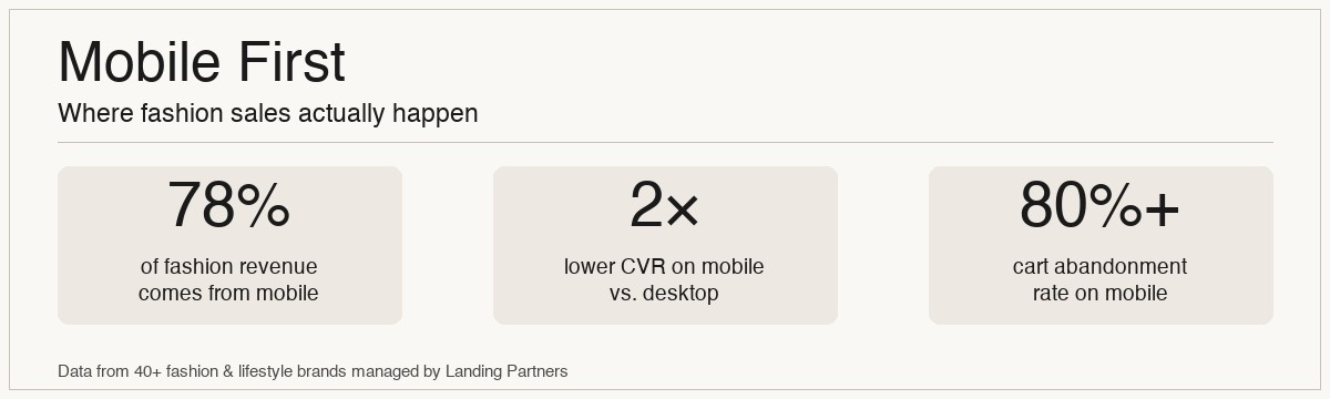
- •Across our fashion clients, we see an average of 78% of all revenue coming from mobile devices.
- •Mobile conversion rates are typically 40-50% lower than desktop, highlighting a huge optimization gap.
- •A mobile-first design isn't about making your desktop site smaller; it's a completely different user experience.
- •Key mobile optimization areas: one-handed navigation, thumb-friendly CTAs, simplified forms, and lightning-fast load times.
- •Fix your mobile experience before scaling ad spend. Sending paid traffic to a broken mobile site is like setting money on fire.
Your customer is on their phone. Right now. Scrolling through Instagram, waiting for a coffee, sitting on the couch. When they see your ad and tap through, they land on your webshop on a small screen, using their thumb to navigate. This isn't a niche scenario-it's the primary way people shop for fashion online.
For years, ecommerce was built on desktop. Big screens, precise mouse clicks, and a patient user. That world is gone. Today, if your fashion webshop isn't built for a mobile experience first, you're actively leaving money on the table. We're not just talking about a responsive design; we're talking about a fundamental shift in strategy, design, and user experience.
Across the 40+ fashion brands we actively manage, we see an average of 78% of total revenue originating from mobile devices. For some streetwear brands, that number climbs as high as 85%.
But here's the problem: while the traffic and revenue are mobile, the conversion rates often aren't. We frequently see mobile conversion rates sitting at half of their desktop counterparts. This gap between traffic and conversion is the single biggest opportunity for most fashion brands today. In this guide, we'll break down what 'mobile-first' actually means in practice and share the specific changes that move the needle.
Why Mobile is a Different Beast Entirely
Thinking 'mobile-first' means acknowledging that mobile users have different needs, behaviours, and limitations. They're often distracted, using a less stable internet connection, and navigating with their thumbs on a screen that's only a few inches wide.
Limited Attention Span: Mobile users are multi-tasking. Your site needs to grab their attention and guide them to purchase with zero friction. Any confusion, any moment of hesitation, and they'll bounce back to TikTok.
Thumb-Driven Navigation: All key elements-add to cart buttons, menus, checkout links-must be within easy reach of a user's thumb. This is a core principle of mobile ergonomics that many sites ignore.
Slower Connections & Performance: Your site must be blazing fast. Large, unoptimized images or clunky scripts will kill your conversion rate. Every second counts. According to Google, the probability of a bounce increases by 32% as page load time goes from 1 to 3 seconds.
Screen Real Estate is Gold: Every pixel matters. Pop-ups, cluttered headers, and unnecessary text can make your site unusable on a small screen. Simplicity and clarity are paramount.
Is your mobile experience costing you sales? A small friction point on desktop can be a complete roadblock on mobile. Book a free, no-obligation webshop analysis and we'll show you the biggest opportunities.
The Anatomy of a High-Converting Mobile Product Page
The product page is where the buying decision happens. On mobile, it needs to be ruthlessly efficient.
1. The Image Gallery: This is the hero. Images should load instantly and be swipe-able. Show at least 5-7 high-quality photos, including on-model shots, flat lays, and detail close-ups. A short video or GIF showing the product in motion is a massive conversion driver. Make sure your swipe gesture is smooth and doesn't accidentally trigger other actions.
2. The 'Sticky' Add to Cart: On mobile, the 'Add to Cart' button should be 'sticky,' meaning it stays fixed at the bottom of the screen as the user scrolls. They should never have to scroll back up to find it. This single change can have a significant impact on your add-to-cart rate.
3. The Size Selector: This is the number one conversion killer in fashion ecommerce. Size selectors must be large, tap-friendly buttons. Dropdown menus are a nightmare on mobile. If a size is out of stock, clearly grey it out and offer a 'Notify Me When Back in Stock' option right there. Don't make them click a size to find out it's unavailable.
For one of our clients, a contemporary womenswear brand, redesigning the mobile size selector from a dropdown to tap-friendly buttons increased the mobile conversion rate by 18% in the first month.
4. Accordion-Style Product Info: Don't dump a wall of text on the user. Use accordions or tabs for details like 'Product Description', 'Sizing & Fit', 'Shipping & Returns'. The user can tap to expand what's relevant to them, keeping the initial view clean and focused.
5. Trust Signals Above the Fold: Display key trust signals like 'Free Shipping over €100' or payment options (Klarna, PayPal) clearly near the price and Add to Cart button. Don't make users hunt for this information.
Rethinking the Mobile Checkout Flow
If your product page is where the decision is made, the checkout is where the sale is won or lost. Cart abandonment rates on mobile are notoriously high, often exceeding 80%. Why? Friction.
Simplify, Simplify, Simplify: Your mobile checkout should ask for the absolute minimum amount of information required. Remove all distractions-no headers, no footers, no 'Continue Shopping' buttons. It should be a single-purpose funnel.
Express Checkout is Non-Negotiable: Offer express payment options like Shop Pay, Apple Pay, Google Pay, and PayPal right at the top of the checkout. This allows returning customers and users with saved details to check out in seconds, bypassing form fields entirely. This is the single most important part of mobile checkout optimization.
Form Fields Designed for Mobile: Make sure your form fields use the correct mobile keyboard types. The 'Email' field should trigger the email keyboard (with the '@' symbol), the 'Phone Number' field should trigger the numeric keypad, and so on. Use a single 'Full Name' field instead of separate 'First Name' and 'Last Name' fields. Every extra tap is a chance to lose the sale.
An audit of your checkout process can often reveal quick wins that significantly boost your conversion rate. Let's find your friction points together.
Beyond Design: The Technical Side of Mobile Performance
A beautiful mobile design is useless if it's slow. Technical performance is the foundation of a good mobile experience.
Image Compression: This is the biggest culprit for slow load times. All your product and marketing images must be compressed and served in next-gen formats like WebP. They should be lazy-loaded, meaning they only load as the user scrolls down the page.
Minimize Apps and Scripts: Every Shopify app or third-party script you add can slow down your site. Be ruthless. Audit your apps quarterly and remove anything that isn't providing a clear return on investment. The 'Social Share' buttons that no one clicks? Get rid of them.
We aim for a Largest Contentful Paint (LCP) of under 2.5 seconds for all our clients' mobile sites. Many stores we audit for the first time are in the 5-8 second range, which is a conversion killer.
The final takeaway is simple: Stop thinking of your mobile site as a smaller version of your desktop site. It's the main event. It's where the vast majority of your customers will experience your brand and make a purchase. Fix the store before you scale spend. Investing in a truly mobile-first experience will provide a better return than almost any marketing channel.
Frequently Asked Questions
Every brand's situation is different. Optimizing for mobile depends on your margin, price point, and stage. If you want to know what the right approach looks like for your specific brand - book a free call and we'll build a plan.