CRO for Fashion Ecommerce: 12 Changes That Moved the Needle for Our Clients
Most fashion brands don't have a traffic problem. They have a conversion problem. Visitors land on your webshop, browse your collection - and leave without buying. Once your store converts well, Google Ads Shopping campaigns become significantly more efficient at capturing high-intent search traffic.
We see this every week when we audit new client accounts. The ads are running. The traffic is coming in. But the numbers don't add up. The store is leaking revenue at every step.
This article covers 12 CRO changes we've implemented across our client base - and what actually moved the needle. Not theoretical improvements. Changes we tested, measured, and saw translate directly into more sales.
Key Takeaways
- •Fashion CRO requires a different lens than generic ecommerce - your customer is buying based on fit, feel and identity. Before diving into fixes, check your numbers against our fashion ecommerce conversion rate benchmarks
- •Product imagery and size UX are the two highest-impact areas we find in almost every audit
- •Social proof placement matters more than volume - it needs to appear at the exact moment of doubt
- •Checkout friction is the silent revenue killer - even one extra step costs real money
- •Fix the store before you scale spend. Use our fashion webshop audit checklist as your starting point. Every euro saved in leakage is worth more than a euro added in traffic
Why Fashion CRO Is Different
In fashion ecommerce, the customer can't touch the fabric, try on the fit, or see how a piece moves on a real body. Every conversion barrier is amplified by that gap between screen and reality.
When we run a CRO audit on a fashion webshop, we're not using the same checklist we'd apply to a consumer electronics store. The questions are different: Does this image answer 'how does it actually fit?' Does this size guide reduce anxiety or increase it? Does this product description match how the brand's customer actually talks about clothing?
The good news: because fashion has specific, predictable conversion barriers, the fixes are also more predictable. Here's what we've changed across 40+ clients - and what consistently moves the needle.
Not sure whether your store is the bottleneck? Book a free webshop analysis and we'll tell you exactly where you're losing customers.
Change 1: Product Photography - Quantity, Angles and Order
The single biggest conversion lever in fashion is imagery. That's not a controversial statement - but the execution is where most brands fall short.
The minimum viable set for a fashion product page is five images: front, back, detail shot, on-model lifestyle, and a scale shot showing how the piece sits on a real body. Most brands we audit come in with two or three.
The order matters as much as the quantity. Leading with a clean, high-contrast front shot - not a lifestyle image - performs better for cold traffic. Save lifestyle images for positions two and three. The first image has to answer 'what is this?' before it can answer 'does this fit my life?'
Model diversity also affects conversion for mid-market and accessible fashion. Customers who can't see their body type represented hesitate. One brand we work with added a second model set - different height and build - and saw a measurable lift in mobile conversion without changing any other element.
Zoom capability is often overlooked. If a customer can't zoom in on fabric texture, stitching, or hardware detail - they don't trust the quality. This is especially acute in the EUR 100-300 price range, where the purchase decision requires more reassurance than a thumbnail can provide.
The single biggest conversion lever in fashion is imagery. The minimum viable set: five images per product. Most brands we audit come in with two or three.
Change 2: Size Selector UX - The Biggest Conversion Killer in Fashion
If we had to name one issue that kills more fashion conversions than any other, it's size anxiety.
Customers don't know if they're a S, M, or L in your sizing. They don't know if your brand runs small. They don't know what your measurements correspond to on their actual body. When that uncertainty peaks at the add-to-cart moment, they leave.
The fix isn't just adding a size guide - it's making the size guide frictionless. The best implementation we've tested: a persistent, inline size guide that opens in a side panel without navigating away from the product page. Not a modal that covers the product. Not a new tab. A panel that lets the customer check measurements while staying on the page and looking at the product.

We also see strong results from a simple 'How does this fit?' brand note added directly on the product page: 'Our pieces run true to size. If you're between sizes, we recommend sizing up.' Simple, direct, honest. It reduces the hesitation spike right before add-to-cart.
For brands with a higher return rate: check whether your return policy language is scaring customers off. 'Easy returns if it doesn't fit' is reassurance. 'Please check the size guide carefully as we cannot cover return shipping costs' is a friction-creator that signals 'we expect this to go wrong'.
Size UX is one of the first things we flag in a store audit. Book a free webshop review and we'll walk through exactly what we find.
Change 3: Social Proof - Placement Over Volume
Most fashion brands think about social proof in terms of quantity: 'we need more reviews.' But placement is usually the bigger problem.
The moment of doubt in fashion is when the customer looks at a product and thinks: 'will this actually look good on me?' That moment typically happens while scrolling through product images - not after reading the description. Which means review snippets showing 'fits beautifully, runs true to size, great quality' need to appear near the image gallery - not buried below the fold.
What we've tested: a short social proof bar positioned between the product images and the add-to-cart button. For several clients, this single placement change lifted add-to-cart rate - without adding a single new review to the site.
Instagram-style visual reviews (customer photos) outperform text reviews in fashion, particularly for clothing with complex fit or texture. The question 'does this look good in real life?' is answered better by a customer photo than by a star rating and a text blurb.
One flag for luxury brands: review volume can work against you. A product with 3 reviews reads as untested and risky. A product with 3,000 reviews reads as mass market. For higher price points, editorial testimonials and press mentions often outperform star ratings as trust signals.
Change 4: Product Description - Format and Voice
The product description is not a spec sheet. In fashion, it's the voice of the brand - and the moment a customer decides whether this piece is for someone like them.
We see two failure modes consistently: descriptions too short ('Cotton blend. Machine washable.') and descriptions too long and corporate (five bullet points about material composition and a care instruction disclaimer). Neither converts well.
The format that performs best: a 2-3 sentence brand voice paragraph - what this piece is, how it was made, who it's for - followed by a clean spec section covering material, fit and care. The paragraph does the emotional work. The spec section handles the rational question.
Keyword placement matters for SEO, but don't let it ruin the voice. Work the primary keyword into the opening sentence naturally. 'This oversized linen blazer is built for the shoulder season' reads better than 'linen blazer for women summer 2025 oversized fit'.
One detail that consistently underperforms: identical copy across product variants. If you have the same blazer in three colourways and all three share the same description, you're missing a conversion opportunity and a return-reduction opportunity. Even one sentence of variant-specific copy - 'the forest green reads almost teal in direct sunlight' - builds purchase confidence and reduces the 'not what I expected' return.
Change 5: Checkout - Fewer Steps, Fewer Fields
Checkout abandonment in fashion is high. Customers get close and pull back. Some of that is structural ('I'll think about it'), but a significant portion is friction we can remove. The email recovery side — reaching shoppers who still left — is covered in our guide to reducing cart abandonment in fashion ecommerce.
The biggest checkout CRO wins are structural, not design-led: removing mandatory account creation, reducing form fields to the minimum needed to fulfil the order, and surfacing the return policy and security guarantee at the payment step - not just in the footer.
Guest checkout is non-negotiable. If your store requires account creation before purchase, you are losing a real share of mobile conversions. This hits hardest on first-purchase traffic from paid social - cold customers with no brand loyalty who don't want a new account in exchange for a shirt.
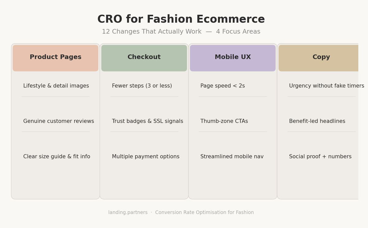
Payment methods: in Belgium and the Netherlands, Bancontact and iDEAL are not optional extras. Each missing payment method is a lost sale for a segment of your traffic. Map your top markets and match the expected local methods - SOFORT in Germany, SEPA direct debit across Europe.
Changes 6-12: Quick Wins We Implement in the First 30 Days
The five changes above are the high-effort, high-impact ones. These next seven are often faster to implement - and we typically tackle most of them in the first month of a new client engagement.
Add a trust bar above or directly below the hero (free shipping threshold, return policy, payment logos). Not buried in the footer - visible on first scroll.
Reduce homepage hero carousel to 1-2 slides maximum. Every additional slide after the first is a distraction, and carousels break or freeze on certain mobile browsers.
Make the add-to-cart button persistent on mobile. Fixed to the bottom of the screen, always visible without scrolling. A customer who has to scroll back up to add to cart won't always bother.
Add low-stock urgency only where it's real. 'Only 3 left in your size' for a product that genuinely has 3 left. Fake urgency is detectable and damages brand trust more than it helps conversion.
Fix the mobile navigation. A confusing mobile menu kills collection browsing, which kills conversion. Best-performing structure for fashion: top-level categories visible in one tap, subcategories in a second layer. No more than two taps to any collection page.
Add currency and language selectors for multi-market traffic. A Belgian customer hitting an EUR-priced store from a DE-targeted ad feels the mismatch. Match the shopping experience to the traffic source.
Optimise page speed. Fashion pages are image-heavy and prone to slow mobile load times. Compress images, lazy-load below-the-fold content. A product page that takes 4+ seconds to load on mobile loses a measurable share of visitors before they even see the product.
Removing mandatory account creation at checkout is one of the highest-ROI changes in fashion ecommerce. Cold customers won't create an account in exchange for a shirt.
How to Prioritise: What to Fix First
The order we recommend: imagery first, size UX second, checkout third.
These three areas account for the majority of conversion loss in fashion-specific audits. Social proof and description improvements compound on top of them - but if your product photography is weak or your checkout requires account creation, those upstream problems override everything downstream.
A quick self-diagnostic before you invest in CRO: does your store sell organically? If visitors from word-of-mouth, direct or branded search convert at a reasonable rate - you likely have a traffic quality problem, not a store problem. But if you have high-intent organic traffic and still see weak CVR, the store is the bottleneck and CRO investment is justified.
The mistake we see most often: making CRO changes and scaling ad spend simultaneously, with no clean measurement baseline. Run a 4-week store-only measurement period first. Know your actual CVR by traffic source before you increase acquisition spend.
Every brand's starting point is different. Book a free webshop analysis and we'll identify exactly what to prioritise based on your actual funnel data - not a generic checklist.
Frequently Asked Questions
Every brand's situation is different. What moves the needle depends on your price point, your customer's decision process, and where your funnel is leaking. If you want to know what the right changes look like for your specific store - book a free webshop analysis and we'll walk through it with you.