The Fashion Webshop Audit Checklist: 25 Things to Fix Before You Scale Your Ads
Key Takeaways
- •Scaling ad spend on a broken webshop burns budget - fix the store first, always
- •Product pages are the highest-leverage area: images, size guides, and social proof placement make or break conversion
- •Mobile UX is non-negotiable - 70-80% of fashion traffic comes from phones
- •Checkout friction is the silent budget killer: every unnecessary step loses roughly 20% of buyers
- •This checklist covers 25 specific fixes across homepage, collection pages, product pages, checkout, and email capture
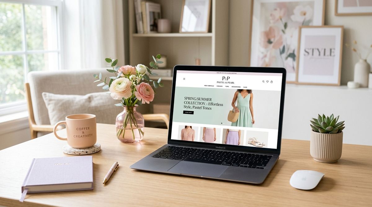
Most fashion brands we work with want to scale their ads before their store is ready for it. We understand the impulse - you have a product you believe in, you want traffic, you want sales. But pouring budget into ads when your webshop has conversion problems is one of the most expensive mistakes in fashion ecommerce.
Before we touch ad spend for any new client, we run a full fashion webshop audit. In about 70% of accounts, we find at least one issue that is actively costing conversions. This checklist is what we use - 25 specific things to review, organized by section of the store.
Why Your Webshop Needs to Be Ready Before You Scale
Paid advertising amplifies what is already there. If your product pages convert at 1.2% and you double your ad budget, you get more traffic converting at 1.2%. You haven't solved anything - you've just spent more to find the same problem at scale.
We use MER (total sales divided by total ad spend) as our primary health metric for fashion brands. If your store's conversion is low, no ROAS target in Meta will save you. The math doesn't work.
**Fix the store before you scale spend.** This is the single most consistent piece of advice we give to fashion founders across every revenue stage.
The good news: most of the issues on this checklist are fixable within days, not months. Some take an afternoon. The 25 items below are ranked roughly by impact within each section.
Not sure where your store stands? Book a free webshop audit and we'll walk through the biggest conversion blockers in your specific store.
The Webshop Audit at a Glance: All 25 Checks
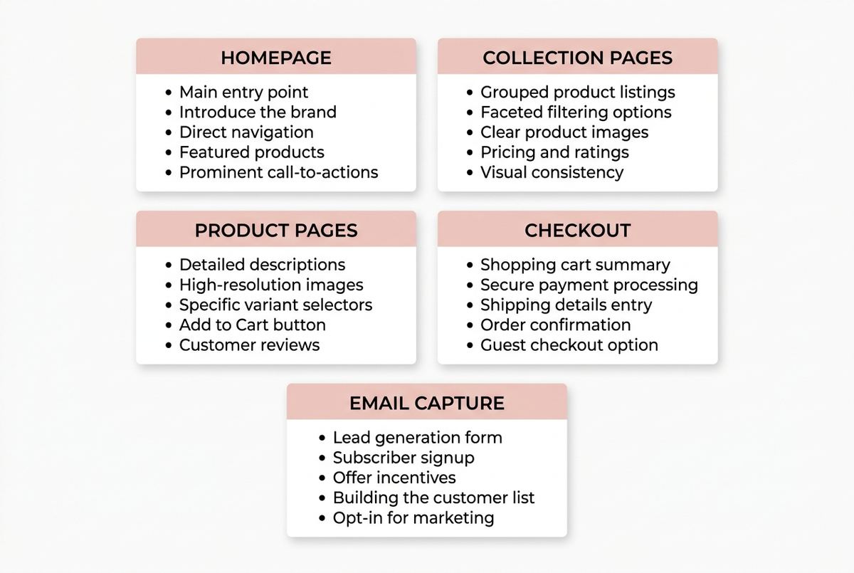
Section 1: Homepage
1. Your value proposition is clear within 3 seconds
When a new visitor lands on your homepage, they need to understand what you sell, who it's for, and why they should care - in under 3 seconds. We see a lot of fashion brands that lead with beautiful imagery but zero clarity. Beautiful and clear are not opposites.
Test this: show your homepage to someone who has never seen it. Ask them to tell you what the brand sells after 5 seconds. If they hesitate, you have a problem.
2. Your hero section has a strong call to action
The hero section should push visitors toward a collection or product. Not just 'Shop Now' - something specific. 'Shop the Summer Edit' or 'New Arrivals - SS25' performs better than a generic button because it sets expectations.
3. Navigation is clean and collection-led
Fashion webshops with more than 7 top-level navigation items confuse visitors. Group by collection or category, not by every sub-type you carry. **A visitor who cannot find what they're looking for within 2 clicks leaves.**
4. Social proof is visible above the fold on mobile
Review counts, press mentions, or customer photos - at least one social proof signal should appear without scrolling on a mobile device. We consistently see higher conversion on stores that show proof early.
5. Page speed is under 3 seconds on mobile
Use Google PageSpeed Insights. Fashion sites often suffer from oversized images and too many third-party scripts. Every second of load time above 3 seconds costs you roughly 10% of mobile visitors. Given that 70-80% of fashion traffic comes from phones, this matters more than most founders realize.
About 70-80% of fashion traffic we see across our client base comes from mobile devices. A 5-second mobile load time is not a minor issue - it's a conversion floor.
Section 2: Collection Pages
6. Filters work correctly and are relevant to your product range
Broken filters are surprisingly common. Size, color, and price filters that don't load or reset incorrectly lose sales silently - there's no error message, the visitor just gets frustrated and leaves. Test all filter combinations on mobile.
7. Product grid images are consistent in size and style
Inconsistent image cropping or mixed photography styles create a chaotic grid that erodes brand trust. **Every thumbnail should feel like part of the same visual world.** This is particularly critical for fashion brands competing on aesthetics.
8. Quick-add or hover functionality works on mobile
Quick-add buttons are great on desktop. On mobile, hover states don't exist - make sure your collection page still allows adding to cart without navigating to the product page, or remove the feature entirely rather than leave it broken.
9. Collection page titles and descriptions include the primary keyword
This is basic SEO hygiene that most fashion brands skip. Your 'Women's Knitwear' collection page should have a title and at least two sentences of description. Not because Google needs it - because it tells visitors they're in the right place.
10. 'Sold out' products are handled well
Push sold-out products to the bottom of the grid. Better: show them with a 'Notify me' button rather than a dead product page. Sold-out products at the top of a collection signal poor inventory management and lower confidence in the brand.
Section 3: Product Pages
This is where we spend the most time in audits. Product pages are the highest-leverage area in fashion ecommerce - they're where the conversion decision happens.
11. You have at least 4-6 product images per item
We have seen conversion rates increase significantly just by adding more angles. In fashion, you're selling without a fitting room. **Customers need to see the front, back, detail shot, fabric close-up, and an on-model shot showing scale.** Six images is the baseline. More is usually better.
12. At least one image shows the product on a model with visible body scale
Size and fit are the biggest concerns for fashion buyers online. A flat lay or ghost mannequin alone is not enough. Show the garment on a person, and include the model's measurements or height in the caption.
13. You have a size guide that is easy to find
The size selector is the biggest conversion killer we find in fashion audits. Customers who aren't sure about their size abandon. A good size guide - specific to the brand, not a generic chart - reduces returns and increases conversion. It should be one click from the size selector, not buried in the footer.
In our experience auditing fashion webshops, the combination of missing size guide and poor fit information is the single most common reason for cart abandonment in the €100-300 AOV range.
14. The size selector is prominent and functional
Test adding every size to cart on mobile. We regularly find size selectors that visually work but fail on specific variants. Also: show which sizes are low stock - this creates urgency without fake countdown timers.
15. Product descriptions answer the questions a customer would ask in-store
What is it made of? How does it fit - true to size, oversized, slim? How should I care for it? What occasions is it for? Your product description is the conversation a sales assistant would have. Write it that way.
16. Reviews are present and displayed on the product page
For fashion brands, reviews should answer sizing questions, not just say 'great product'. If you use Okendo, Yotpo, or Loox - make sure reviews are loading on the product page itself, not just on a reviews tab. Buyers who see reviews convert at a higher rate than those who don't.
17. Related products or 'complete the look' suggestions are present
This is both a conversion driver and an AOV lever. Styling suggestions relevant to the current product - not just a generic 'you might also like' carousel - increase basket size. They also help visitors who didn't convert on the first product find something that works.
18. The add-to-cart button is clearly visible without scrolling on mobile
This sounds obvious, but we see it broken constantly. Test your product pages on an iPhone SE and a mid-range Android. The add-to-cart button should be visible immediately - not after scrolling past four images and three description paragraphs.
If you're unsure whether your product pages are converting as well as they should, we offer a free webshop analysis as part of our onboarding. Book a call here.
Section 4: Checkout
Checkout is where the money is. Every unnecessary step, every confusing moment, every trust signal missing from this flow is a direct hit to your revenue.
19. Guest checkout is available
Forcing account creation at checkout is one of the fastest ways to lose a first-time buyer. Every extra required step loses roughly 20% of buyers. Guest checkout should be the default or at minimum equally prominent as account login.
20. You accept the payment methods your customers expect
For European fashion brands: iDEAL for Dutch customers, Bancontact for Belgian customers, and PayPal or Klarna for broader European audiences. Missing a preferred payment method is a silent exit point. Check your checkout analytics for where people are dropping off.
21. Your checkout shows trust signals
SSL certificate, return policy summary, and secure payment badges should be visible in the checkout flow. **First-time buyers need reassurance at the moment they're entering payment details.** This is not optional - it directly affects conversion from cart to purchase.
22. Shipping costs are clear before the final checkout step
Surprise shipping costs at the last step are the leading cause of checkout abandonment in fashion ecommerce. Show shipping costs on the cart page, not at payment. Better: offer free shipping above a threshold that makes sense for your AOV.
In the fashion accounts we audit, surprise shipping costs at the final checkout step account for a disproportionate share of abandoned carts - often more than payment method issues or account creation friction.
Section 5: Email Capture
Your email list is a first-party asset that no algorithm change or platform policy can take from you. Building it deliberately - from your webshop - is one of the highest-return things you can do in early-stage fashion ecommerce.
23. You have a popup with a real offer - not just 'Subscribe for updates'
Discount-based popups (10% off your first order) still convert better than content-based ones for most fashion brands. The offer needs to be specific enough to feel valuable. 'Sign up for our newsletter' is not an offer - it's a task. Test different incentives and measure opt-in rate as your metric.
24. Your popup timing and trigger are set correctly
Popups that fire immediately on arrival interrupt the shopping experience. We recommend triggering on exit intent or after 30-45 seconds on the product page. This captures visitors who are genuinely considering buying but haven't committed yet.
25. Your confirmation email after sign-up is set up and delivers value
Most brands set up the popup and forget the follow-up. Your first email after someone opts in is your highest open-rate email - often above 50%. **Use it to deliver the offer, introduce the brand, and link to your best-selling collections.** A weak or missing confirmation email wastes the opt-in.
How to Prioritize: Quick Wins vs Longer Projects
Not everything on this list takes the same effort. Here's how we think about prioritization for fashion brands before a scaling push:
Fix first (under 2 hours each):
Page speed optimization (compress images), add-to-cart button visibility on mobile, guest checkout activation, shipping cost transparency on the cart page, and popup timing adjustment. These are configuration changes - not design projects.
Fix before scaling (1-5 days each):
Size guide creation, adding product images (especially on-model shots), review integration and display, and checkout trust signals. These require content or design work but have direct, measurable conversion impact.
Ongoing improvement:
Product description quality, navigation structure, and related product logic. These improve over time as you learn what language resonates with your customers and which styling combinations drive basket size.
The order matters. **Don't spend a week improving product descriptions if your checkout is losing 40% of buyers to surprise shipping costs.** Fix the leaks before you optimize the funnel.
Every brand's situation is different. What to tackle first depends on your current traffic volume, your price point, and where your biggest drop-off points are. If you want to know what the right audit priorities look like for your specific store, book a free call and we'll run through it with you.