CRO for Supplement Webshops: How to Increase Conversion Rate When You Can't Show Before-and-After Photos

If you sell supplements online, the standard CRO playbook only gets you halfway. You can't show before-and-after photos. You can't make medical claims. You can't run a testimonial that says your product cured someone's fatigue. So what do you do?
Key Takeaways
- •Ingredient transparency on product pages is the single highest-impact CRO change for supplement webshops.
- •Trust architecture (certifications, sourcing, founder story) replaces the social proof levers that health brands can't use.
- •Subscription-as-default, with clear cancel-anytime copy, moves subscription take-up more than any other checkout change.
- •Money-back guarantee visibility at checkout is the most effective last-moment hesitation remover for health products.
- •Mobile CRO for supplements requires a specific approach: ingredient tables, certification badges, and subscription selectors all need mobile-first redesign.
Why CRO for Supplement Webshops Is Different
The default CRO playbook - better photos, stronger social proof, faster checkout - still applies. But supplement brands face conversion barriers that most CRO guides don't address.
You can't show a before-and-after photo of someone who lost weight using your fat burner. You can't say 'clinically proven to reduce cholesterol.' You can't feature a testimonial that says 'my joint pain disappeared after 2 weeks.' **All of that is either legally restricted, platform-banned, or both.**
So the visual and social proof levers that drive conversion for beauty, fashion, and fitness products are partially unavailable. What replaces them? Three things: ingredient transparency, results-adjacent social proof, and trust architecture. We'll walk through each - and the specific fixes we've implemented for supplement clients.
Not sure where your supplement webshop is losing conversions? Book a free webshop analysis and we'll identify the highest-impact fixes for your specific situation.
Product Page Optimisation: Ingredient Transparency as a Conversion Driver
For most supplement brands, the product page is where conversion is won or lost. And the single most consistent change we make is **making ingredient information clearer, earlier, and more prominent.**
Supplement buyers are increasingly informed. They've researched ashwagandha dosages. They've read about bioavailability. They want to see not just what's in your product, but how much, in what form, and why that form matters.
Move the ingredient table above the fold
Most supplement brands bury the ingredient panel at the bottom of the product page. That's a mistake. Move it above the fold - or at minimum, make it the second visible section after the hero image. Buyers who are ingredient-checking (a significant portion of supplement buyers) shouldn't have to scroll to find it.
Explain the ingredients in plain language
Don't just list 'KSM-66 Ashwagandha 600mg.' Write: 'KSM-66 is the most studied form of ashwagandha - at 600mg, this matches the dose used in research on stress reduction.' That single sentence increases time on page and reduces bounce from informed buyers who are evaluating quality.
Add a 'Why this form?' line for each key ingredient. Magnesium glycinate vs. magnesium oxide. Vitamin D3 vs. D2. These distinctions signal quality to informed buyers - and educate the uninformed ones at the same time.
Across our supplement clients, product pages with clearly explained ingredient sections - dose, form, and why - show meaningfully higher add-to-cart rates than pages where ingredients are listed but not contextualised.
Dosage and routine clarity on the product page
How many capsules? When to take them? With food or without? These questions create hesitation at the moment of purchase. A short 'How to take it' section (2-3 lines, before the add-to-cart button) removes that cognitive friction. We've added this to every supplement product page we've worked on - and it consistently reduces post-purchase return rates as well.
Trust Signals That Actually Work for Health Products
You can't use the most powerful trust signals in health marketing - before/after transformations and medical endorsements are either banned or legally restricted. So you build trust differently.
Certifications and third-party testing
GMP certification, ISO accreditation, Informed Sport testing, lab reports - these carry real weight with supplement buyers who have been burned by underdosed or contaminated products. **Put them prominently on product pages, not buried in an 'About Us' page.**
Position certification badges near the 'Add to cart' button. We've tested placing these in the hero section of the product page versus at the bottom - placement near the conversion action consistently outperforms footer placement.
Founder story and sourcing transparency
'Where does your magnesium come from? Why did you choose that supplier?' Buyers of quality supplements ask these questions. Brands that answer them - with real specificity, not marketing copy - build the trust that drives conversion.
A short founder note on the product page (2-3 sentences, first person, specific about sourcing decisions) outperforms generic 'premium quality' copy. Specificity is credibility.
Supplement brands that surface third-party testing certificates and sourcing transparency directly on product pages see stronger add-to-cart rates, particularly from health-conscious buyers who are actively filtering out underdosed products.
Review Strategy for Supplements
The default approach - collect as many reviews as possible and display average star rating - is a floor, not a ceiling. Supplement reviews require a more deliberate strategy because outcome expectations vary dramatically across buyers.
Volume and recency matter more than average rating
A supplement with 12 reviews at 4.9 stars converts worse than one with 180 reviews at 4.4 stars. **Volume signals real traction.** Build your review collection process accordingly. The right Klaviyo trigger: request a review 6-8 weeks after purchase for most supplements, not 3-7 days. That's when results become visible.
Goal-specific review filtering
If you sell a general multivitamin, a buyer researching 'energy support' should be able to filter reviews from people with the same goal. Adding filtering by 'goal' or 'concern' to your review display increases engagement with the review section and improves conversion from review readers. We've validated this across supplement clients.
Review content without medical claims
'I feel more focused in the morning' - compliant. 'It cured my brain fog' - not compliant on Meta or Google Shopping. If you're syndicating reviews to your product feed for paid channels, audit review content for policy compliance before pushing it to your feed.
Want a full review of your supplement product pages against our CRO checklist? Book a free webshop analysis - we'll show you exactly where conversion is leaking.
Subscription vs. One-Time Purchase: Framing That Moves the Needle
If you offer a subscription model, how you present the choice between subscription and one-time purchase is one of the highest-leverage CRO opportunities on the entire site.
The default approach is two buttons, one price, and a small discount badge. That's leaving significant conversion - and customer lifetime value - on the table.
Lead with subscription as the default selected option
Don't make the buyer choose subscription - make it the default, with one-time purchase as the secondary option. The cognitive default effect is well-documented. Most buyers who see a subscription pre-selected will stay with it unless they actively object. **Make them opt out of subscription, not opt in.**
Show the saving in absolute terms, not just percentage. 'Save €6.00/month' reads stronger than 'Save 15%.'
Address the cancellation objection directly
The primary objection to subscription is loss of control - 'what if I want to cancel?' A one-line reassurance ('Cancel anytime - no commitment, no fees') placed directly under the subscription option removes the friction at the exact moment it arises.
Switching from an equal-choice subscription/one-time layout to subscription-as-default, with clear cancel-anytime copy, is consistently the highest-impact single change we make for supplement brands that offer recurring billing.
Checkout Optimisation for Supplement Brands
Supplement buyers have a specific hesitation at checkout that other categories don't face as acutely: **'What if it doesn't work?'** This doubt peaks at the moment of payment. Your checkout needs to address it directly.
Money-back guarantee placement
If you offer a money-back guarantee (and for supplements, you should), it needs to be visible at checkout - ideally in the order summary sidebar or directly above the payment button. Not just on a landing page. Not just in the footer. **At the moment they're entering payment details**, a simple '30-day satisfaction guarantee - if you're not happy, we'll refund you' statement can recover a meaningful slice of abandonment.
Remove unnecessary fields
Supplement buyers research heavily before they buy. By checkout, they've made the decision. Every extra field is friction. Audit your checkout: do you actually need a phone number? A date of birth? A 'how did you hear about us?' field? Remove anything that isn't required for fulfilment or legal compliance.
Progress indicators on mobile
For multi-step checkouts, a clear progress bar reduces abandonment. Buyers want to know how many steps remain. This is particularly important on mobile, where the end of the checkout form isn't visible without scrolling.
Mobile CRO for Supplement Brands
Supplement buyers increasingly research and purchase on mobile. But supplement product pages are often designed desktop-first, with dense ingredient tables, multi-column layouts, and small text that becomes unreadable on a phone screen.
Ingredient tables on mobile
A three-column ingredient breakdown that looks structured on desktop becomes a squinting exercise on a 375px screen. Rebuild ingredient tables as vertically-stacked cards for mobile - each ingredient on its own row, with dose and form clearly readable at mobile font sizes.
Certification badges at mobile scale
Many supplement brands use small badge images that become illegible on mobile. Make certification icons tappable, with readable label copy beneath each badge. If a buyer has to zoom to read 'GMP Certified', the trust signal is lost.
Subscription selector touch targets
The subscription/one-time selector needs large, clearly separated touch targets. If the two options require precision tapping, mobile conversion suffers. Use clearly separated buttons with adequate padding - treat them like radio buttons with large hit areas, not small toggles.
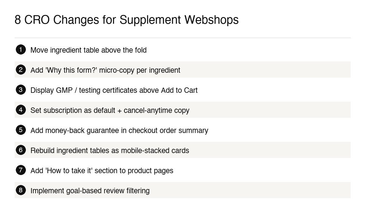
8 CRO Changes We've Made for Supplement Clients
Here's what we've actually implemented, and what moved the needle:
Moved ingredient table to above the fold - lifted time-on-page and add-to-cart rate
Added 'Why this form?' micro-copy to each key ingredient - reduced bounce on product pages
Added GMP/testing certificates directly above the add-to-cart button - improved trust and lower abandonment
Switched subscription to default-selected option with cancel-anytime copy - improved subscription take-up rate
Added money-back guarantee to checkout order summary - reduced payment-step abandonment
Rebuilt ingredient tables as mobile-stacked cards - strong improvement in mobile conversion rate
Added 'How to take it' section to product pages - reduced post-purchase return rate
Implemented goal-based review filtering on product pages - higher engagement and conversion from review readers
Frequently Asked Questions
Every supplement brand's conversion challenges are specific to their product, price point, and acquisition mix. If you want to know exactly where your webshop is losing conversions and what to fix first - book a free webshop analysis.